Financial Assets logo design
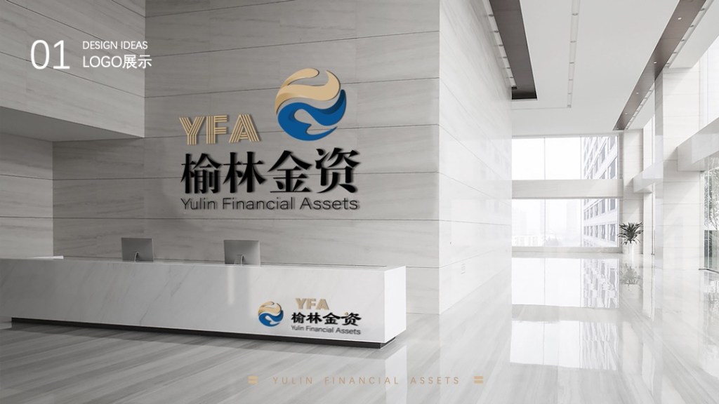
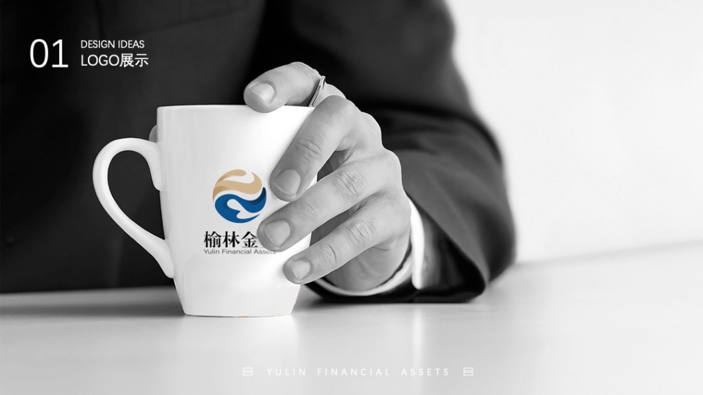
This logo is an adjustment to the original design 1, extracting the letters “Y” and “FA” from the English translation of “Yulin Financial Assets”. The design is predominantly spherical, with internal curves and flowing forms symbolizing the liquidity and flexibility of the financial industry, indicating the company’s innovative spirit and ability to adapt to change. In terms of details and structure, the bottom features smooth lines outlining the Yellow River’s “几” (ji) bend, and a hand-like shape resembling a supporting element.

Option 2
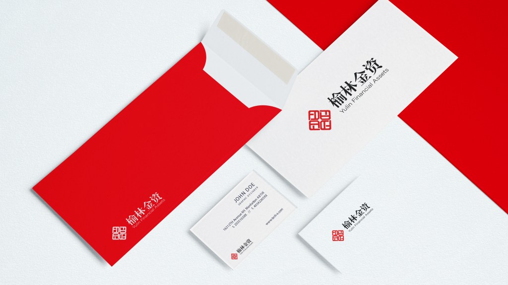
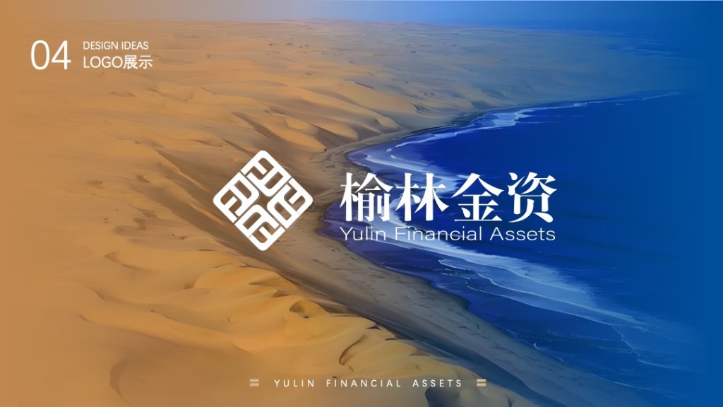
The logo uses the initials F and A of Financial and Assets as its base units. The four units are arranged in a cycle, symbolizing the company’s four core values: integrity, responsibility, professionalism, and striving for excellence. The inner square and outer graphic form a coin-like structure, symbolizing the company’s presence in the financial sector.
Option3
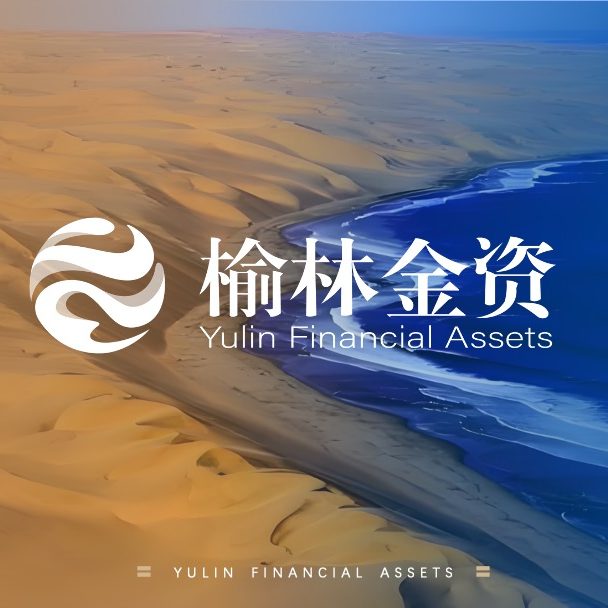
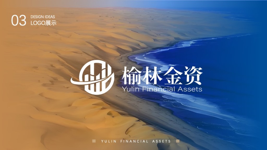
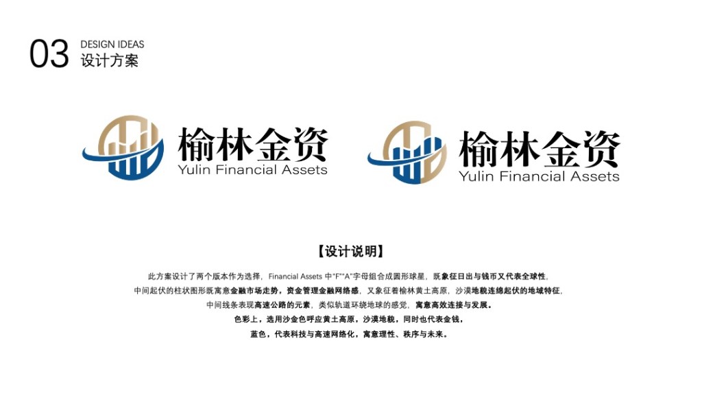
This design offers two versions for selection. In “Financial Assets,” the letters “F” and “A” combine to form a circular sphere, symbolizing both sunrise and currency, as well as global reach.
The undulating columnar graphic in the center represents both financial market trends and the network-like nature of financial management, while also symbolizing the undulating terrain of the Loess Plateau and desert landscape of Yulin.
The central lines represent highway elements, resembling a railway track encircling the Earth, signifying efficient connectivity and development.
In terms of color, a sandy gold tone echoes the Loess Plateau and desert landscape, while also representing money.
Blue represents technology and high-speed networking, symbolizing rationality, order, and the future.
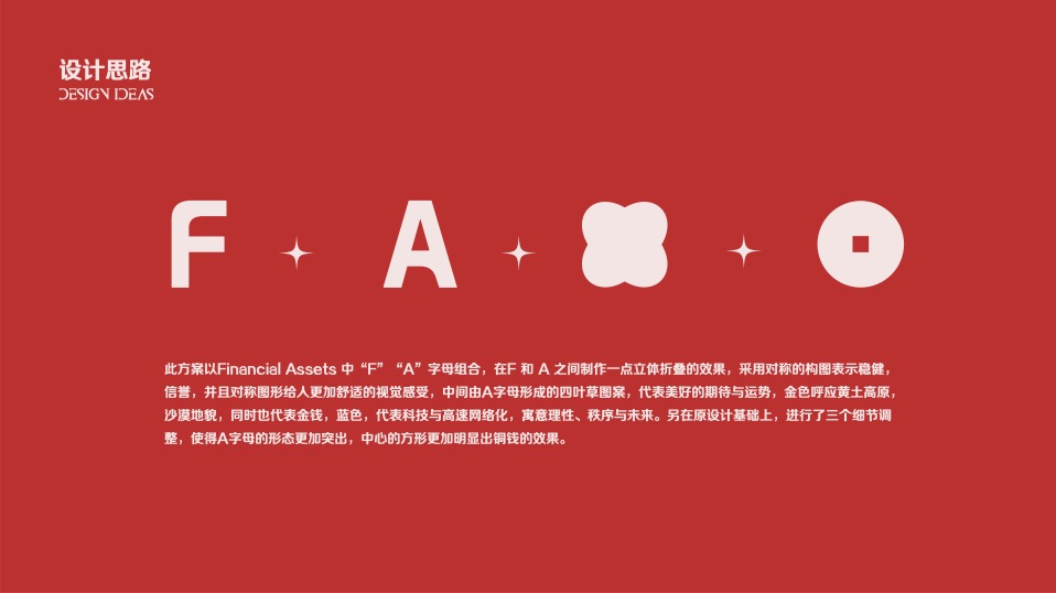
Option 4
This design uses the letters “F” and “A” from Financial Assets, creating a three-dimensional folding effect between the F and A. The symmetrical composition represents stability and credibility, and the symmetrical graphic provides a more comfortable visual experience. The four-leaf clover pattern formed by the letter A in the center represents positive expectations and good fortune. The gold color echoes the Loess Plateau and desert landscape, and also represents money. The blue color represents technology and high-speed networking, symbolizing rationality, order, and the future.
Option 5
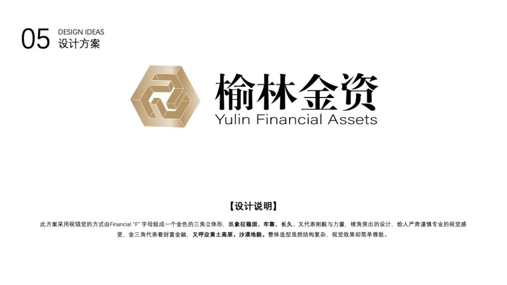
This design uses optical illusion to form a golden triangular three-dimensional shape from the letter “F” of the Financial Association. This symbolizes stability, reliability, and longevity, as well as fortitude and strength. The sharp angles convey a serious, cautious, and professional visual impression. The golden triangle represents wealth and finance, while also echoing the Loess Plateau and desert landscape. Although the overall structure is complex, the visual effect is simple and elegant.
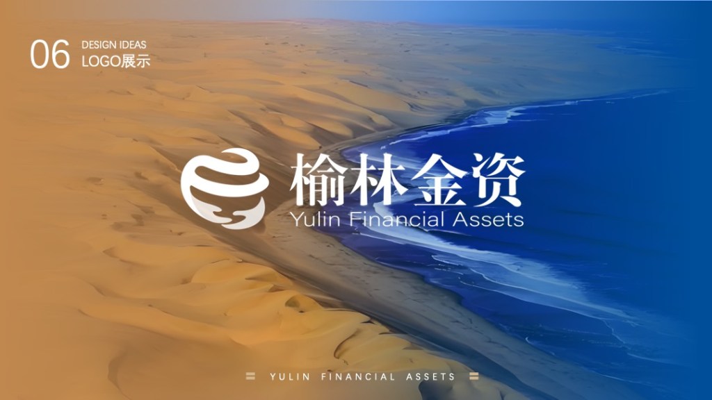
Option 6
This design uses a circular ring inscribed with a sphere, symbolizing the global economy. The upper ring features a deformed Financial “F” in blue, representing technology and advancement. The two hands below symbolize Yulin Jinzi’s solid support for the company’s difficulties, while the winding, streamlined shape also represents the Yellow River.