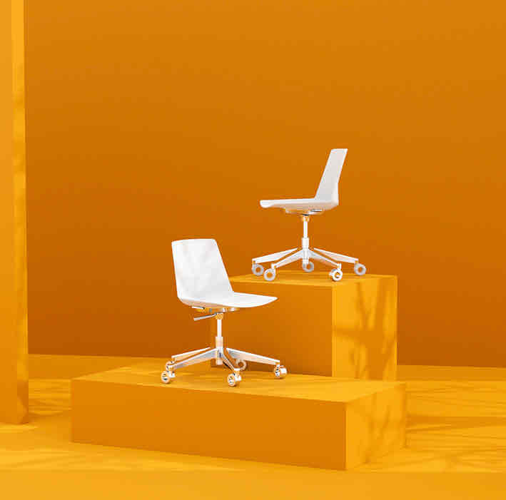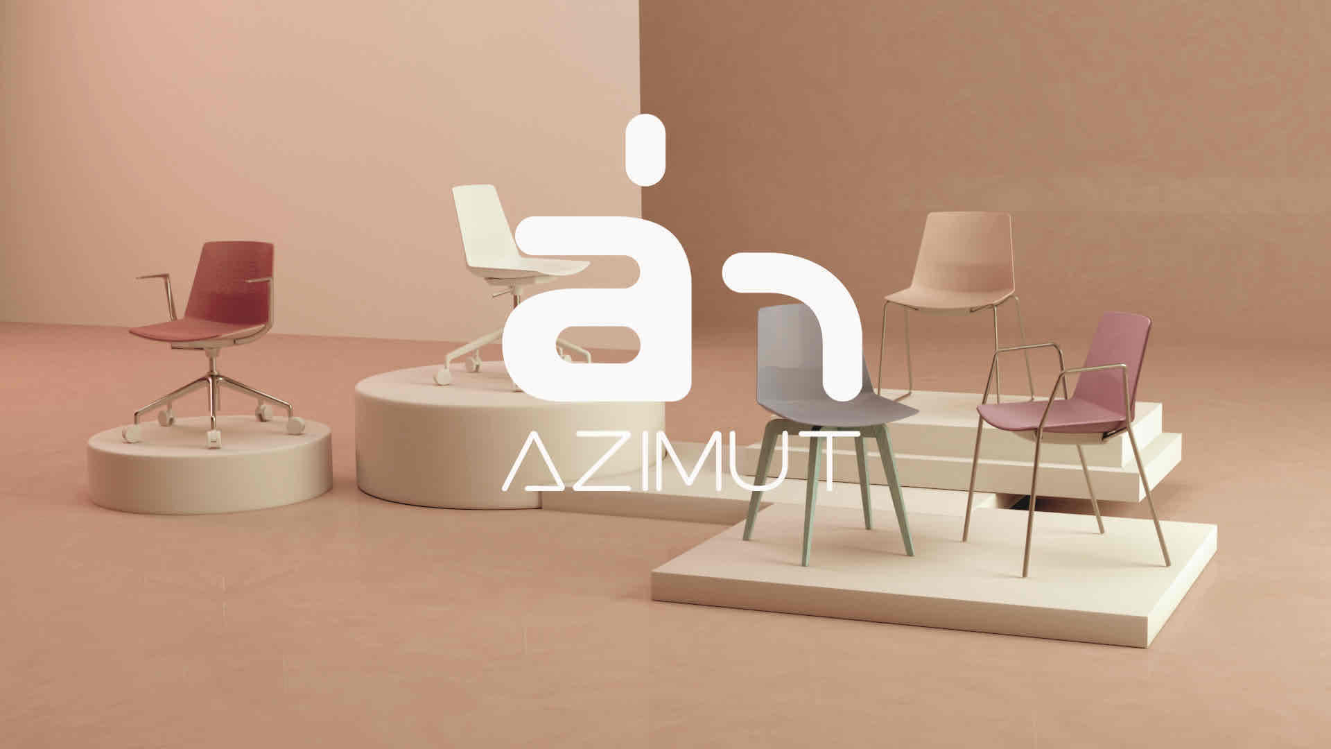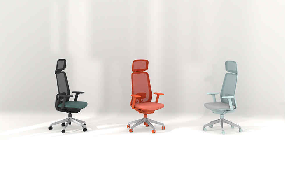
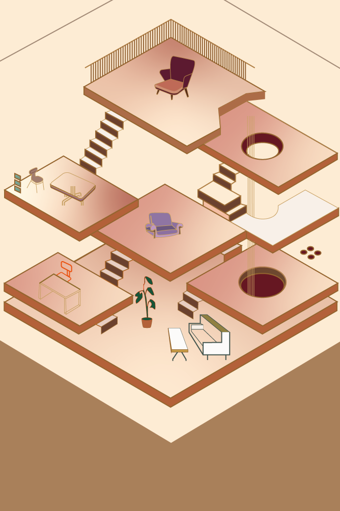
This is a furniture product design company that primarily focuses on designing the mechanical structure of products, as well as selecting and applying materials and manufacturing processes.
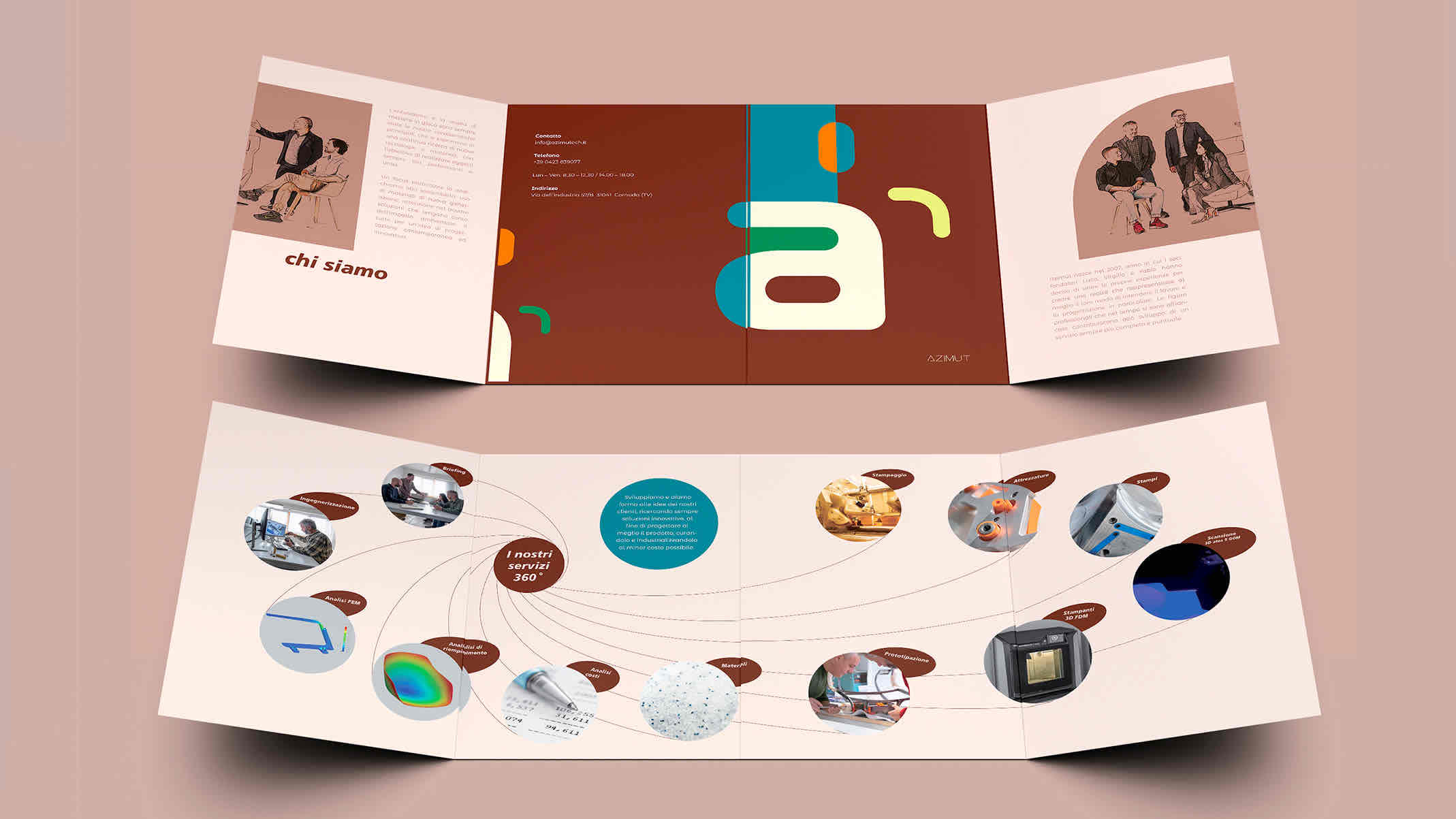
I was responsible for facilitating communication between designers and Chinese clients and assisting with project management. Additionally, I handled the company’s promotional work, including website creation and maintenance, 3D rendering, dynamic visual effects production, brochure design, and more.
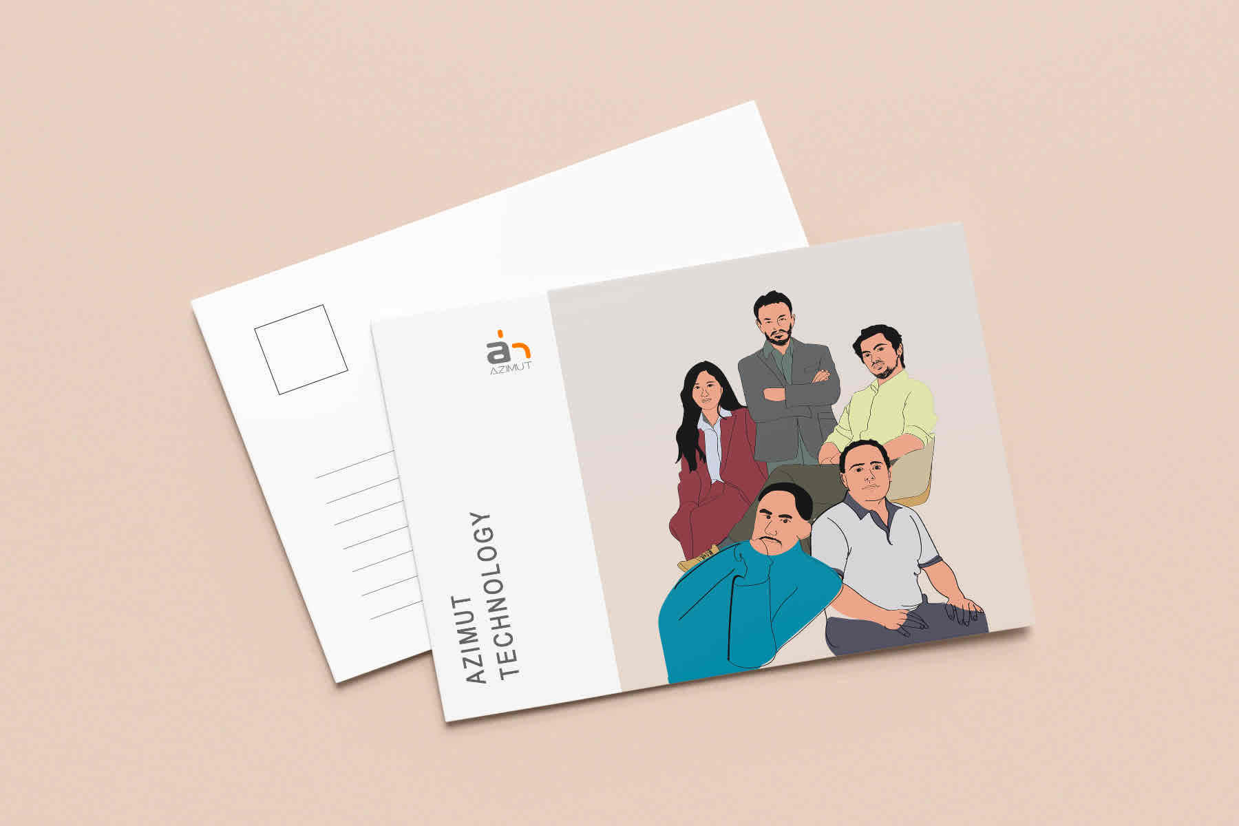
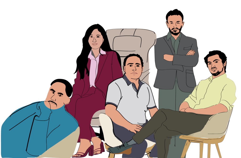
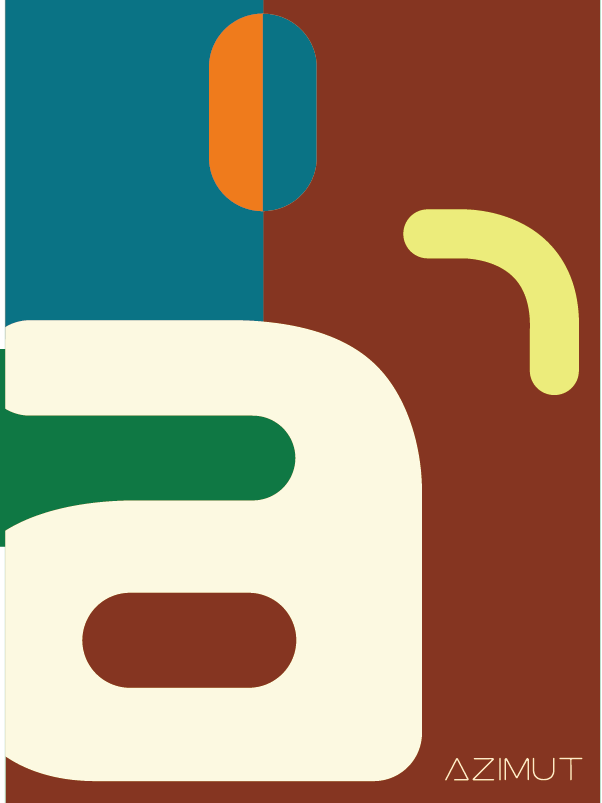
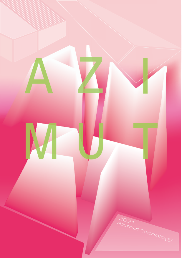
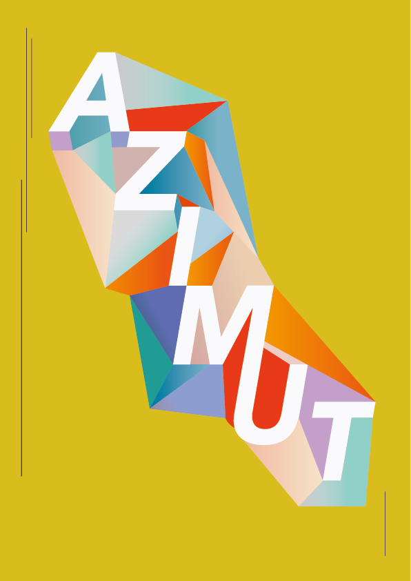
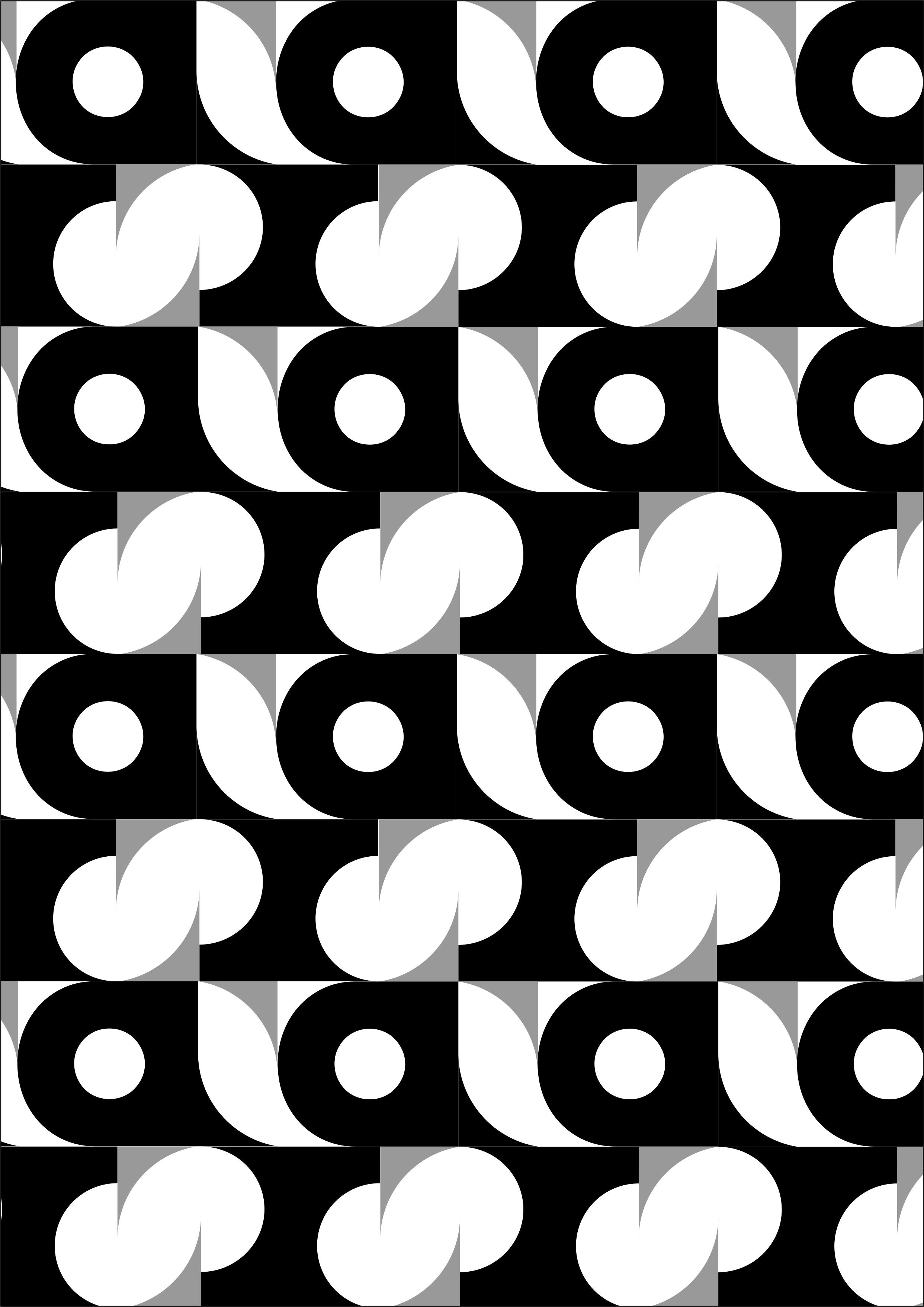
I created various graphic designs based on the company name, which can be used as covers for corporate publications.

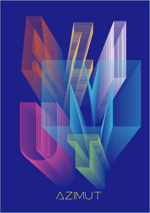
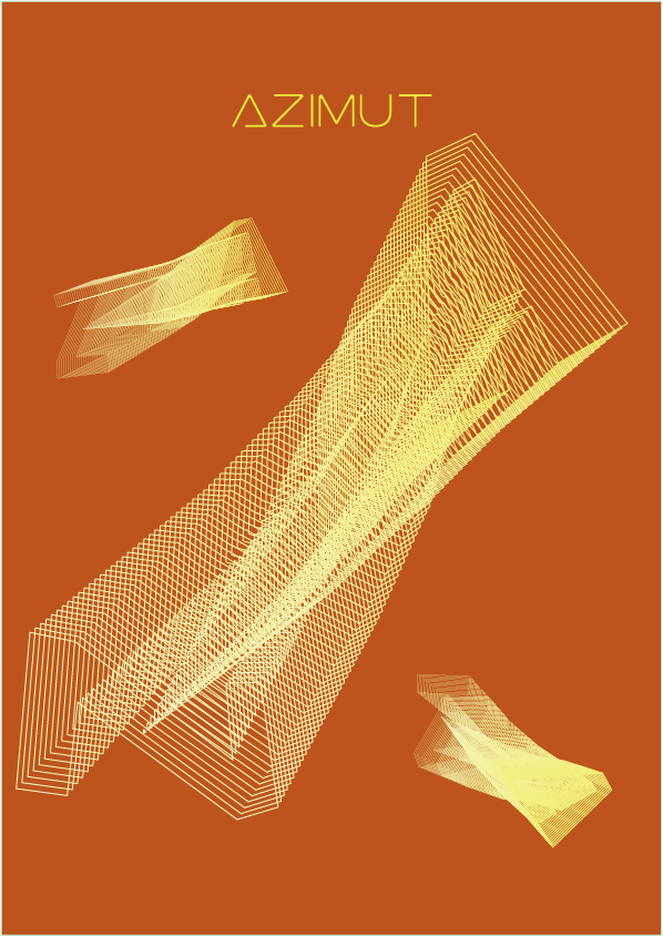
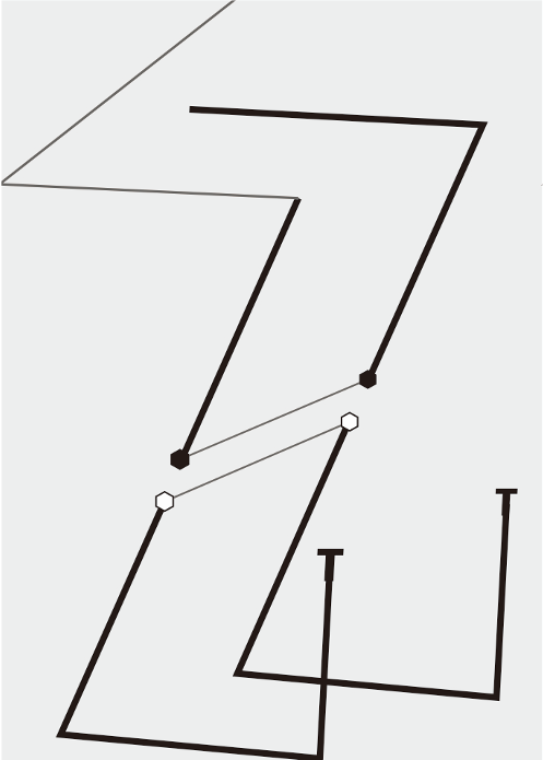
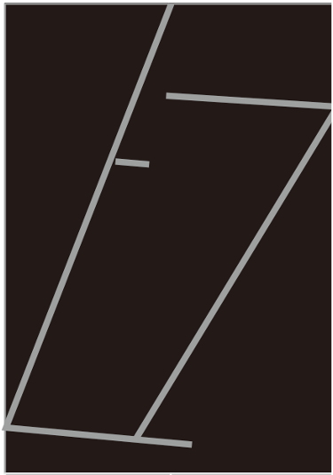
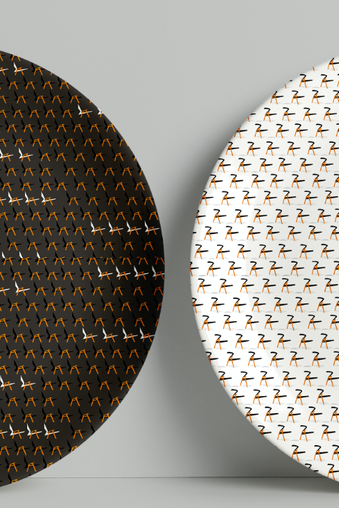
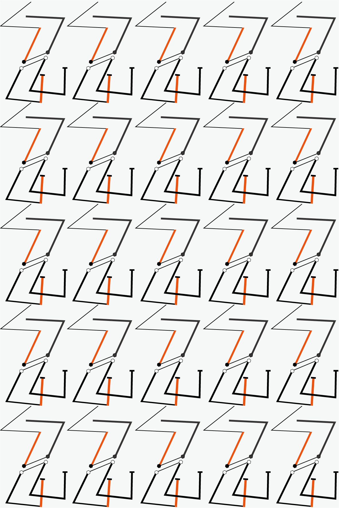
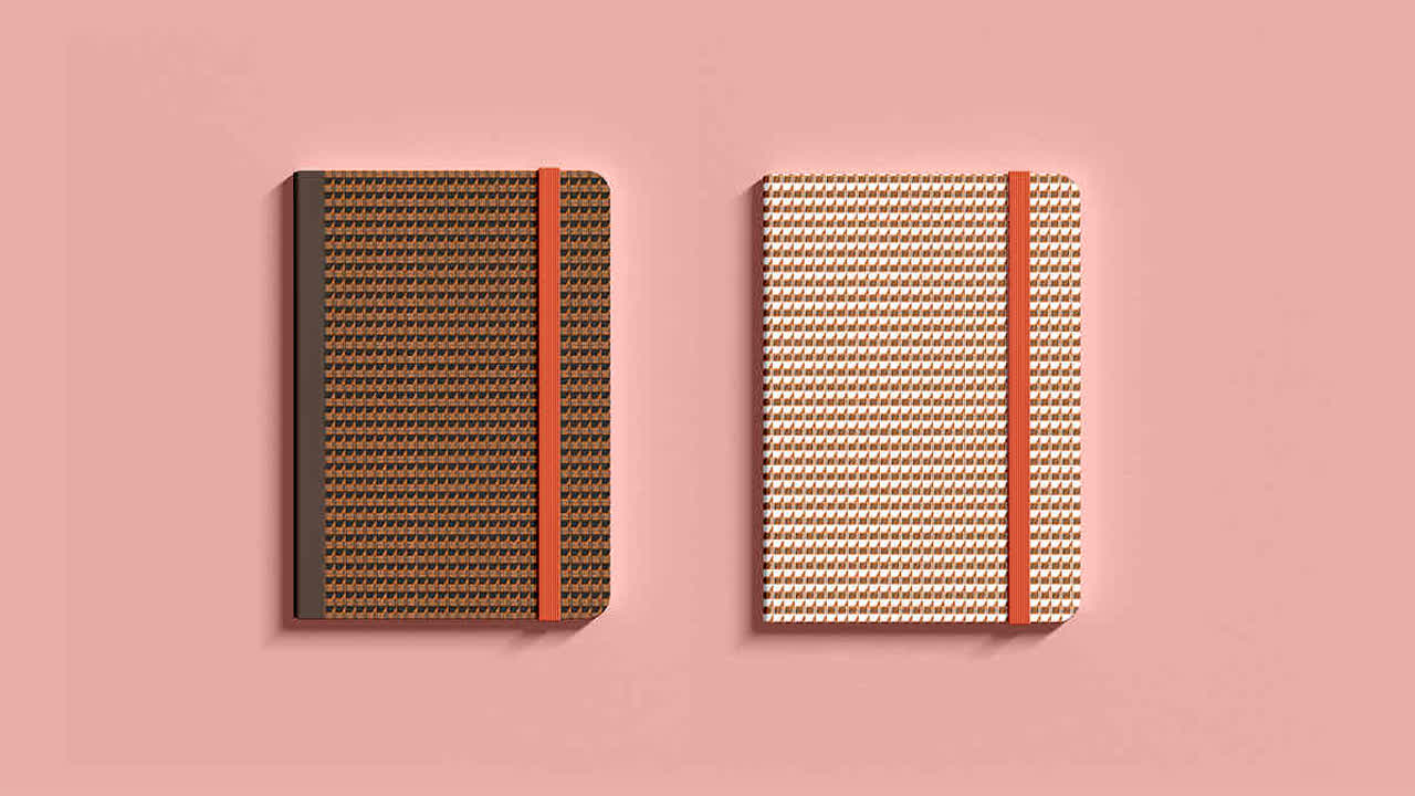
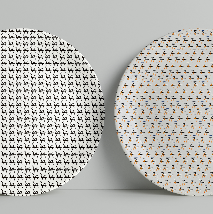
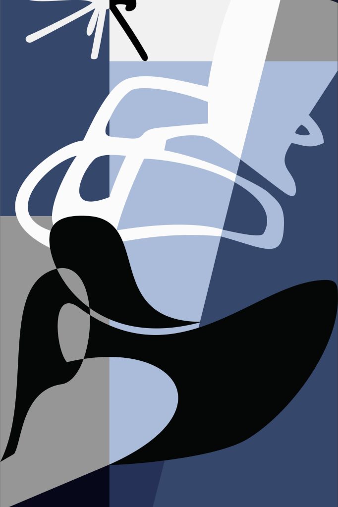
I combined the letters “A” and “Z” with the shape of a chair to design a series of patterns, which can be used as design elements for the company’s branded derivative products.
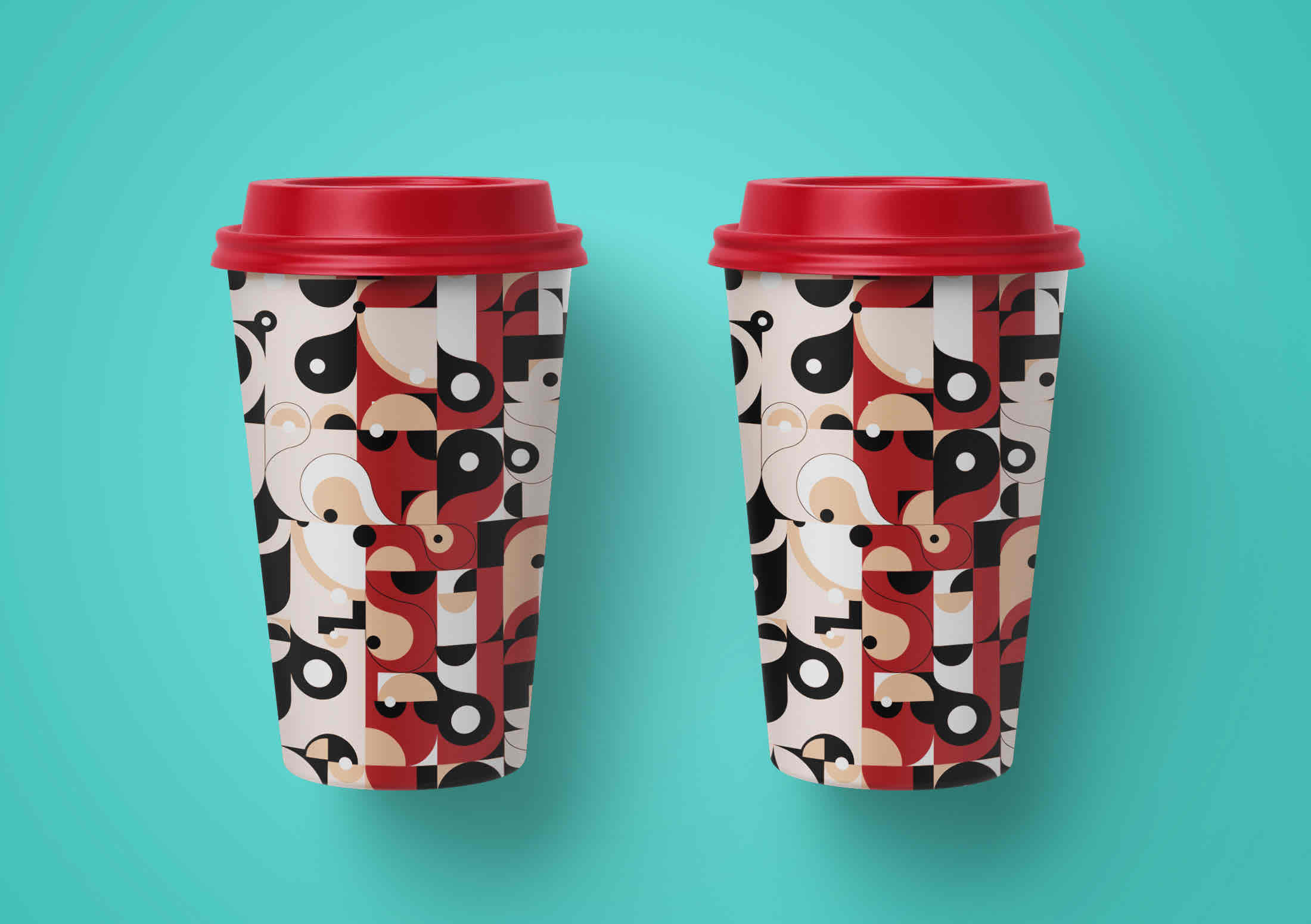
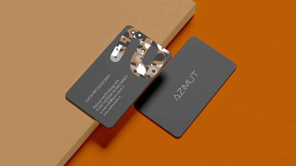
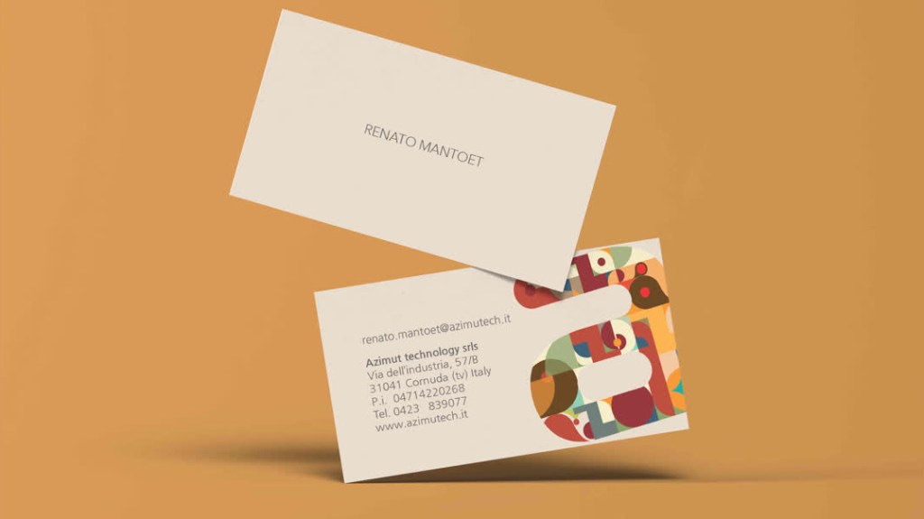
I geometrically transformed the letter “A” to create a series of patterns and incorporated them into the company’s business card design.
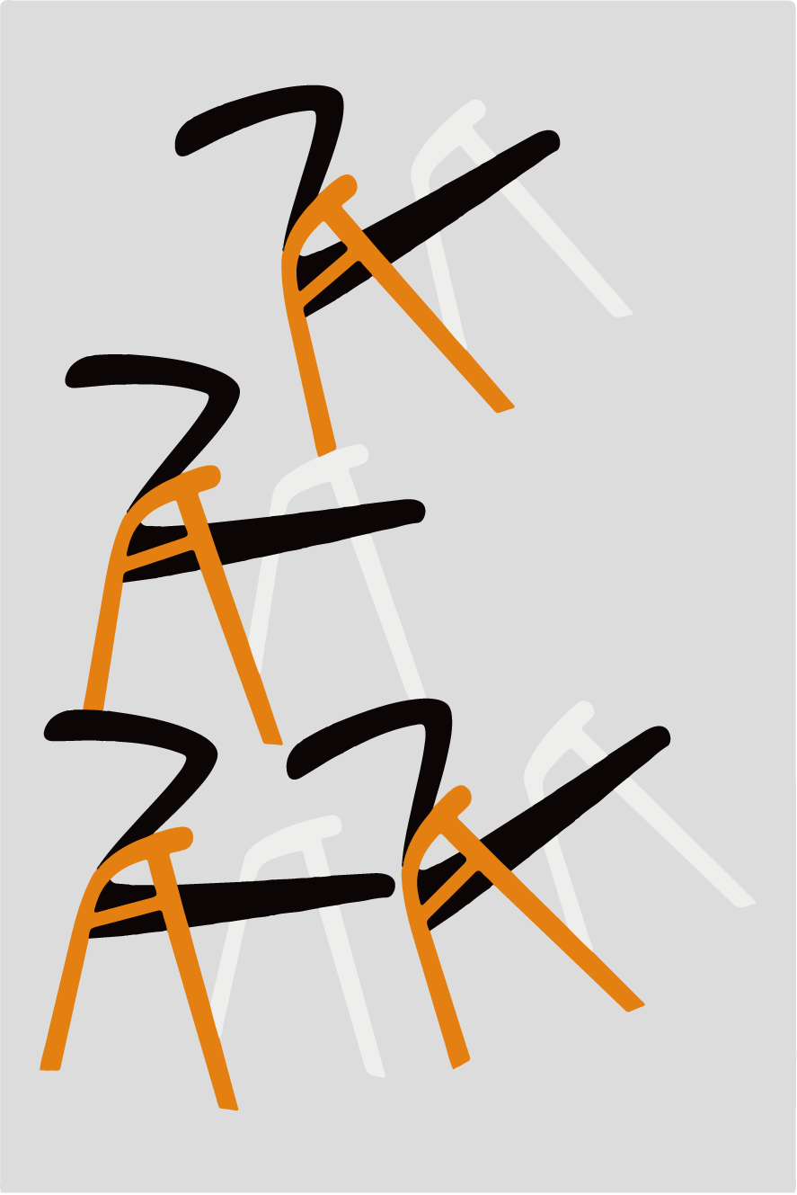
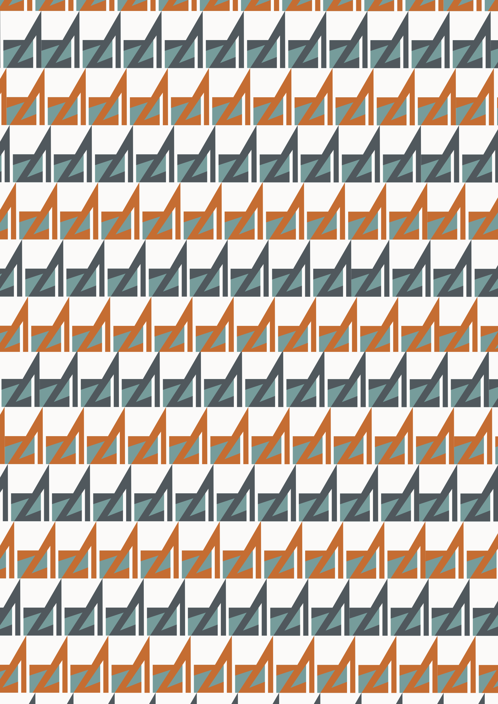
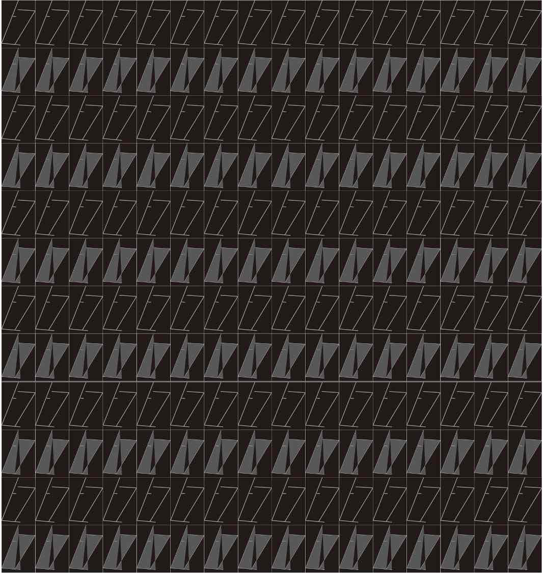
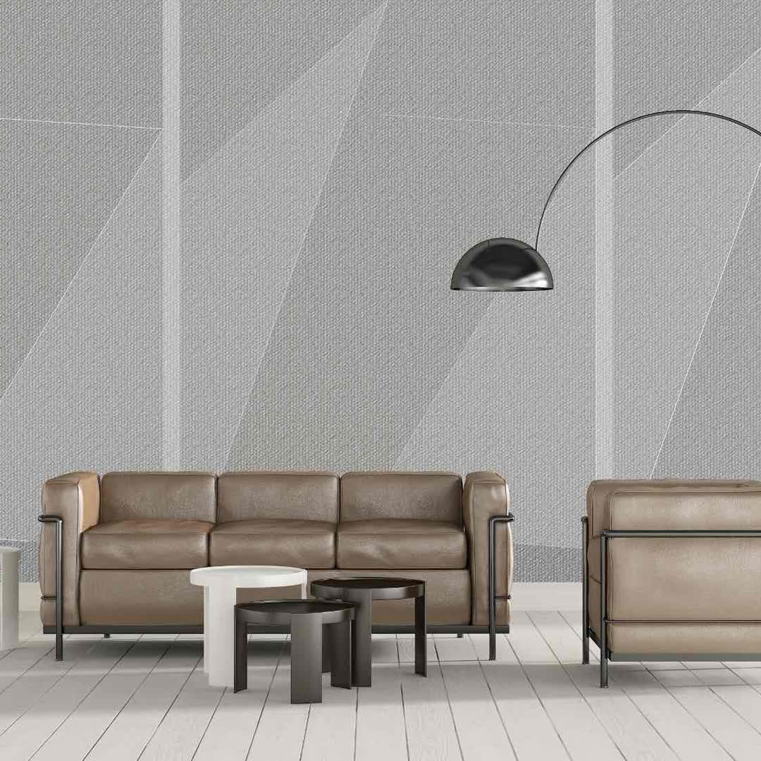
I continuously combine geometric shapes with the company’s product characteristics to design various patterns. This helps break the dull and rigid impression often associated with mechanical design and manufacturing, making it appear more dynamic and engaging.
The animation begins with an egg falling from the light, symbolizing the initial spark of inspiration as designers discuss ideas. Next, engineers conduct experiments and analyses to refine the concept. The process then moves to the manufacturing stage, where workers carefully test and paint the product. Finally, the egg hatches into a beautiful bird, representing the product reaching the customer.
To enhance the storytelling, I set the entire animation in a lush forest, incorporating various plants and animals to emphasize the creativity and playfulness of the design process.