New energy, new economic landscape, new way of life, new world.This is a logo design created for a Chinese hydrogen energy company.
The logo for a hydrogen energy company should reflect the core values of sustainability, innovation, and clean energy. Drawing inspiration from the essential qualities of hydrogen — lightness, purity, and power — the design should convey a sense of modernity and environmental consciousness.A minimalist approach can emphasize clarity and efficiency, using smooth, flowing lines to represent hydrogen’s role in creating a cleaner future. Shapes like circles or subtle wave patterns can symbolize energy flow and balance, while sharp, dynamic elements can evoke a sense of progress and advanced technology.
Draft Concepts for the Hydrogen Energy Company Logo
Based on the design concept above, I explored hundreds of variations, experimenting with shapes, colors, and typography. I focused on balancing simplicity and innovation, using smooth lines, circular forms, and dynamic elements to represent energy flow and sustainability.
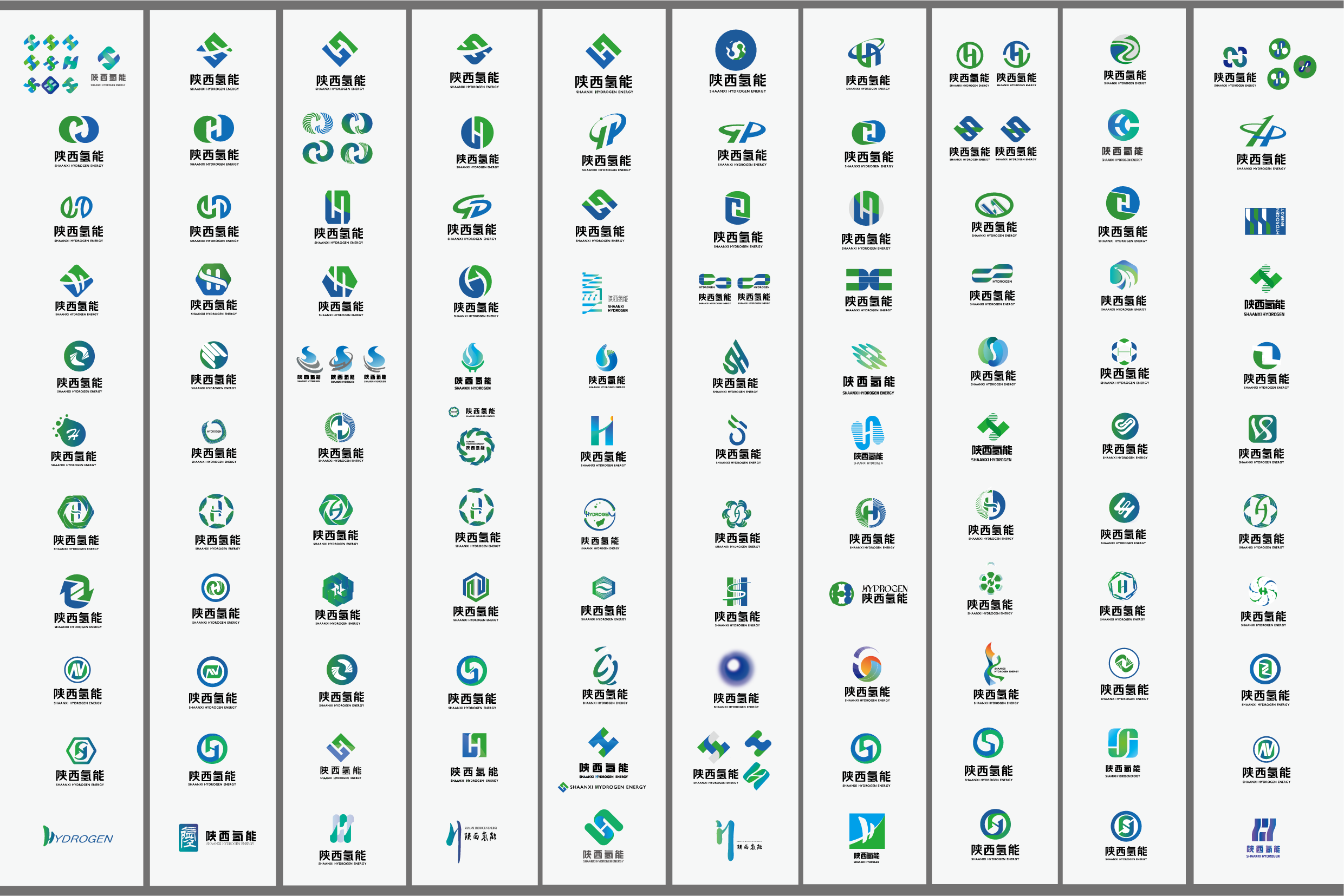
Inspired by streamlined shapes, circularity, and the initials “S” (for the company’s location) and “H” (for hydrogen), I explored designs that symbolize energy flow and sustainability. These drafts balance modernity and simplicity, creating a unique and memorable visual identity.


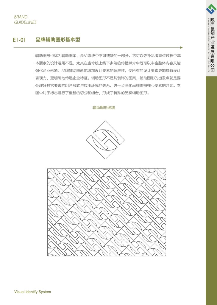
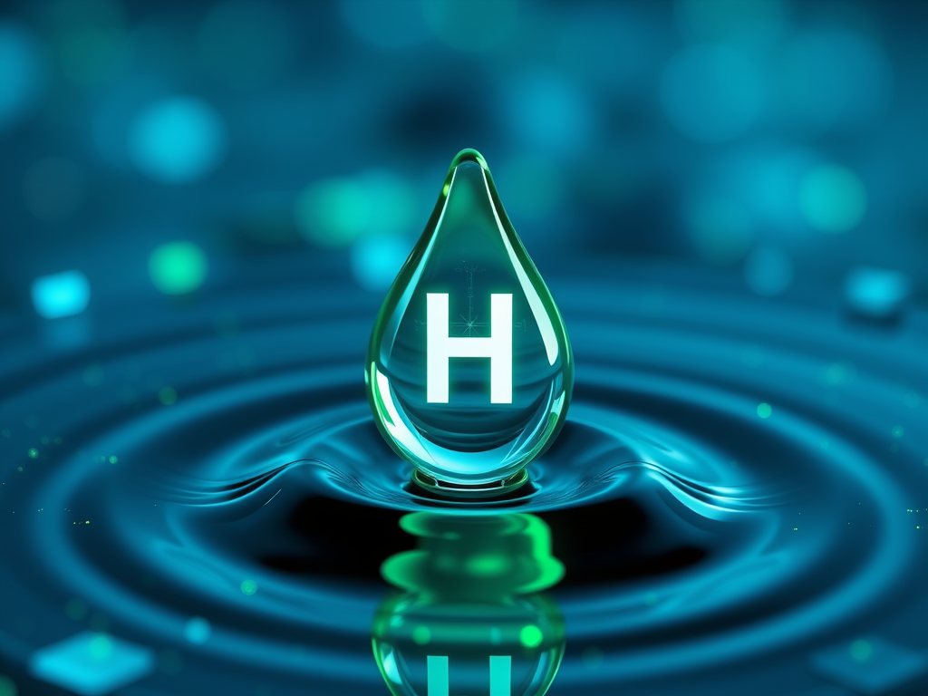
I further experimented by incorporating water droplet shapes, chemical element symbols, the globe, and calligraphic lettering. These elements emphasize hydrogen’s purity, global impact, and the company’s cultural identity, creating diverse and meaningful design possibilities.


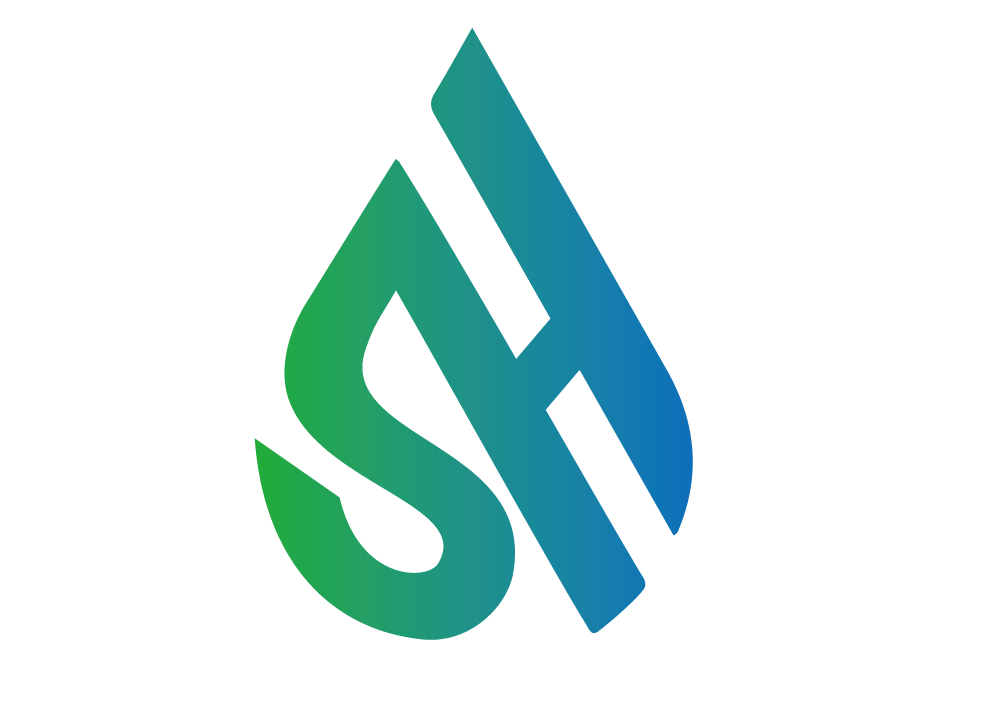

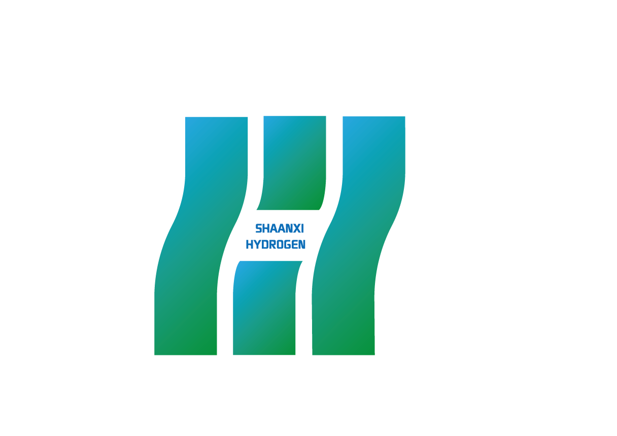


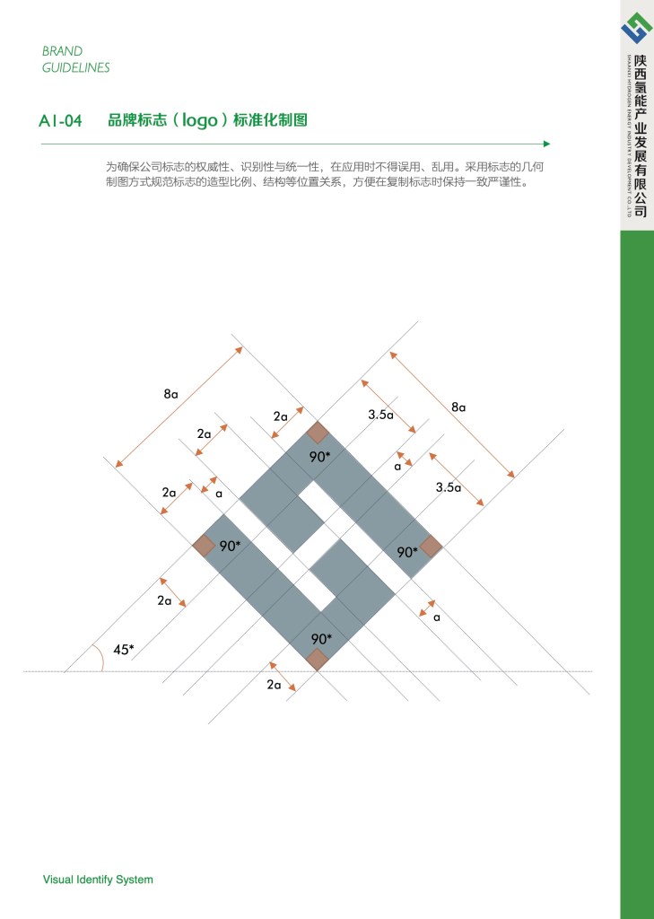
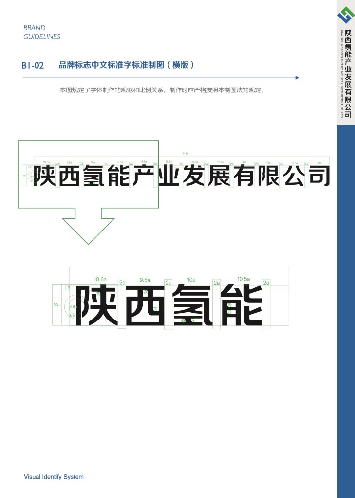
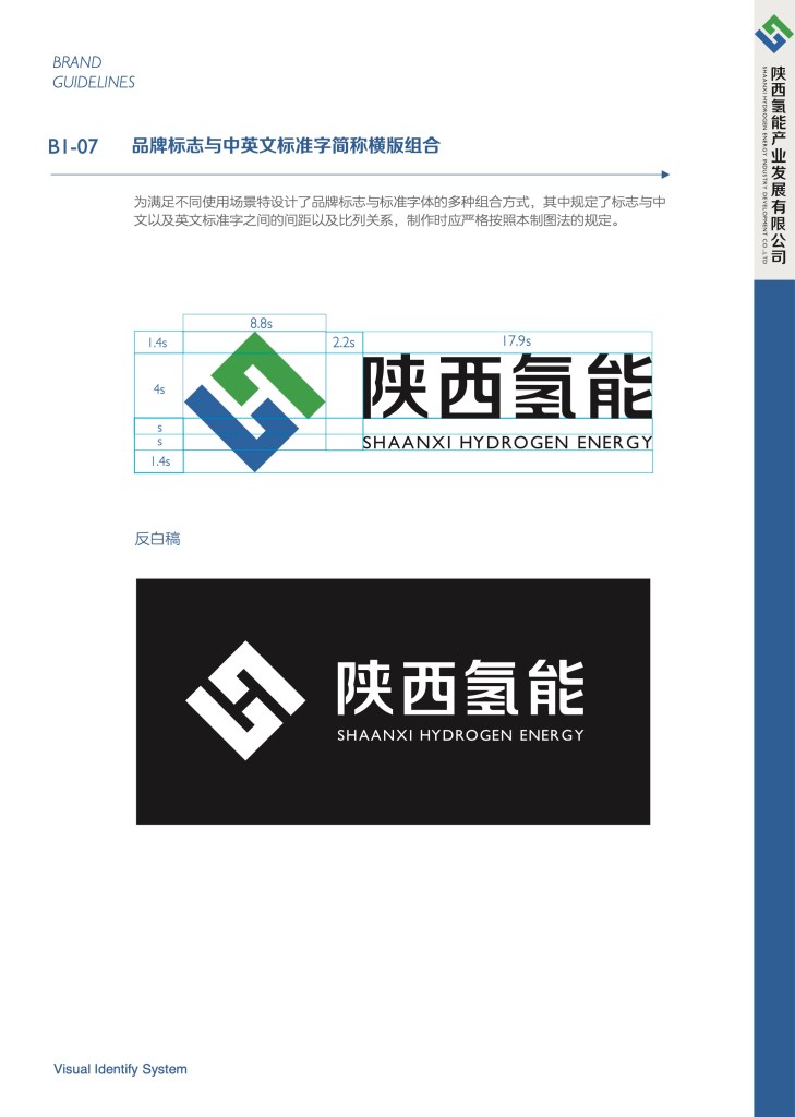
The client ultimately selected the simplest and most precise design. This choice reflects clarity, professionalism, and a focused vision, aligning perfectly with the company’s commitment to innovation and clean energy.